Sync Overview
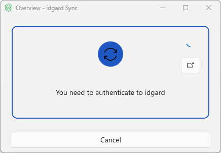
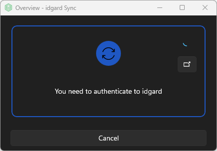
The SyncOverviewView - Application Status Dialog is a compact status window that displays the current synchronization state of the application. It appears in the bottom-right corner of the primary display and will show real time updates.
The AppState is the same as the indicator dot on the TrayIcon.
Layout Structure
- Status Border - Color-coded border that changes based on application state
- State Symbol - Icon with dynamic color and symbol (glyph)
- Progress Ring - Appears when the application is busy (syncing, uploading, downloading)
- Activity Button - Top-right corner button to open the Activity View
- Status Message - Text showing current operation or state
- Action Buttons - Context-sensitive buttons at the bottom (e.g. Login or Cancel)
Application States, Colors & Glyphs
The status area shows the current sync state at a glance:
| State | Color | Symbol | Message |
|---|---|---|---|
| None | None | Initial state | |
| NotAuthenticated | Error color (gray) | | Login required |
| Synchronizing | Busy color (blue) | | Currently syncing meta-data |
| UploadOrDownloadInProgress | Busy color (yellow) | | Traffic is on going |
| Success | Success color (green) | | Sync completed |
| Error | Error color (red) | | Error description |
Context-Sensitive Actions
- No button: When everything is up to date, no action button is shown.
- Login button: When sign-in is required, a login action is shown.
- Cancel button: While a sync operation is running, you can cancel it.
Note
Single left-click on the tray icon opens Sync Overview Window.